 Some games we play for the excitement, some we play for scares, and some we play for the challenge. And then there are games like Tsuro ($3.99), the digital port of the 2004 board game, that are all about introspection, the kind of game you play while lying on a couch with a glass of wine (or your spirit of choice) in one hand and the iPad in the other. Thunderbox Entertainment gladly took the challenge of bringing Tsuro to mobile and has done a pretty good job representing the abstract board game on the iPad and iPhone screens. Going with a “zero UI" philosophy, the developers tried to create a sense of immediacy between the player and the board and they have, mostly, succeeded. They tried to give us a faithful representation of how it feels to play the physical game, but at the same time also added 3 new ways to play the game, expanding Tsuro‘s challenge and replayability.
The port is visually stunning, and while there were a few things I would’ve liked to see different, this is a fun game that trades complexity and challenge for introspection and relaxation and prods players to enjoy the journey more than the destination. Many have complained about the Facebook-only multiplayer mode, but sometimes developers have to make difficult choices if they are to stay on budget; after all, the game shines in sharing the journey face-to-face, or pass-to-play, rather than playing one turn every few hours in an online game.

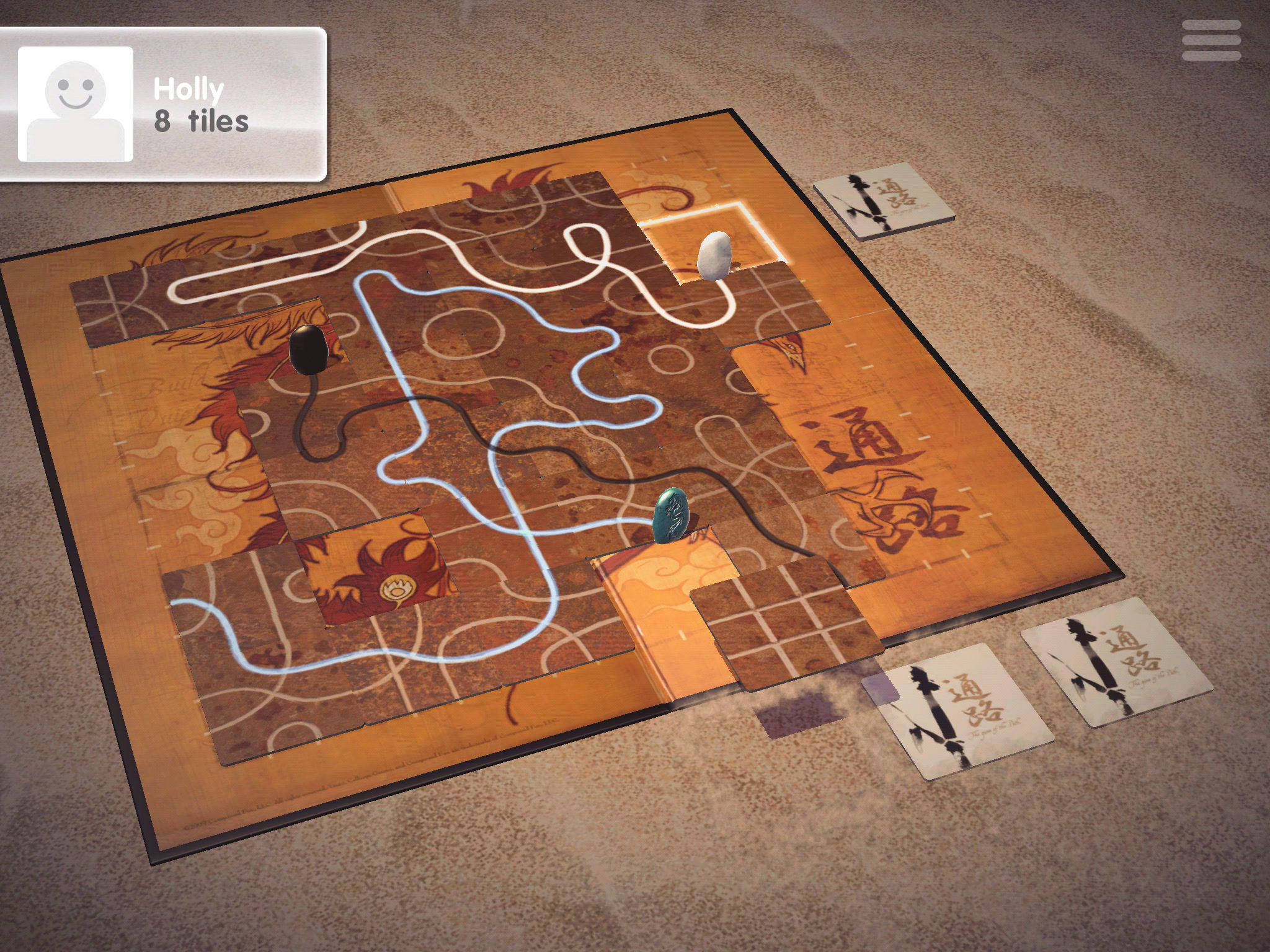
If you’ve never played Tsuro, this is a relatively-simple board game where 2-8 players (or even one player in the digital port version) lay one tile in front of their token each turn in order to continue their journey across the (beautiful) board. Each turn you get three tiles, and you select one, rotate it to suit your path, and put it on the board. There are no outside borders, so in the original mode, your purpose is to keep your token on the board the longest. The more the game is played, the harder that goal becomes because the paths grow longer and often lead towards the sides of the board. There’s some player interaction since if there’s another player’s token next to the tile you’ll place, that token moves at the same time as yours. So, overall Tsuro isn’t very demanding strategically, but it’s a great light board game that could act as a gateway to more complex board games.
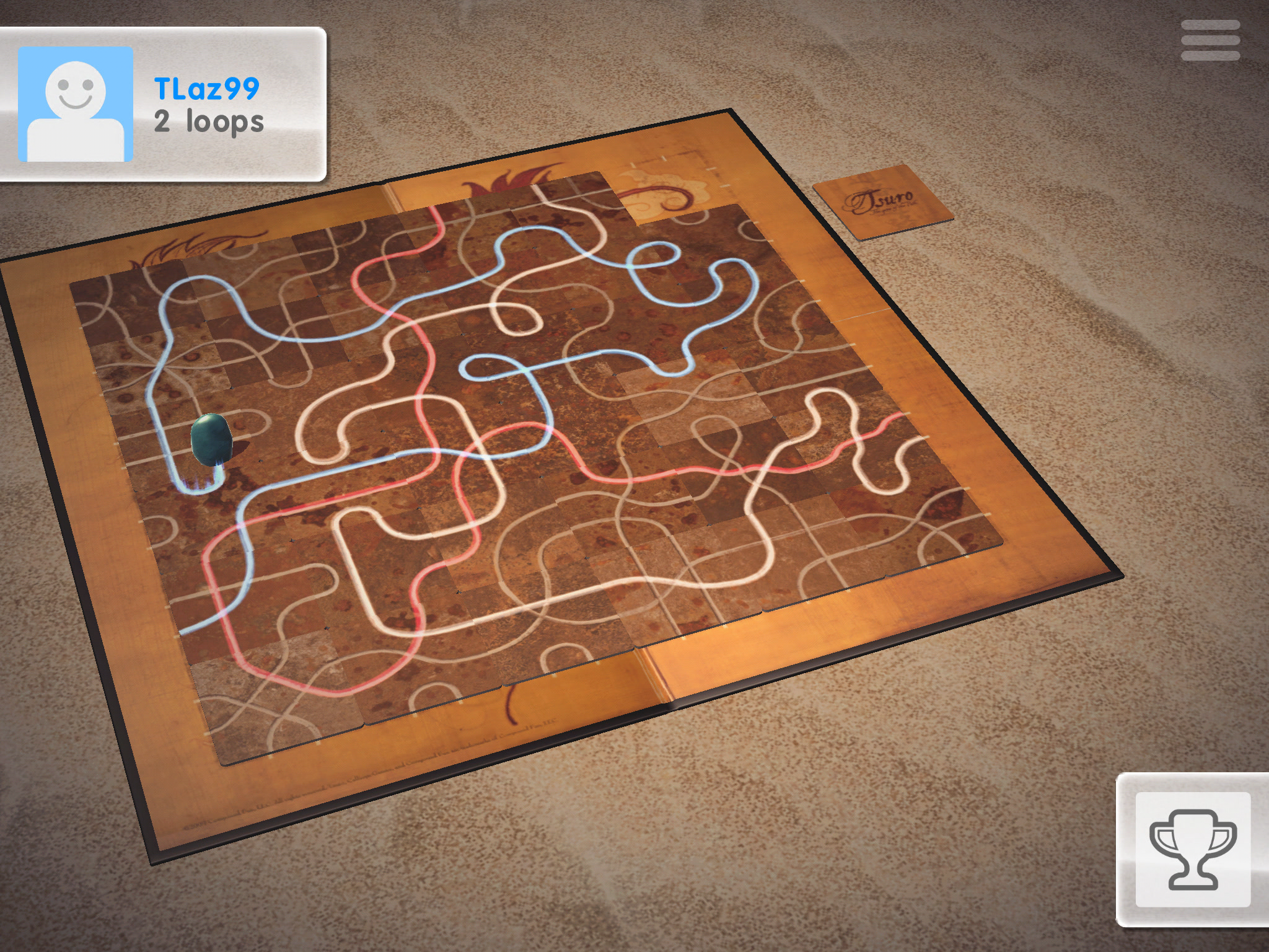
Thunderbox felt that the game would benefit from more modes, so it added ‘Longest Path,’ ‘Loop Battle,’ and ‘Solo Mode’ along with three AI personalities to spice up play. These different modes change the way the game is played quite significantly since you won’t be seeking to just stay on the board but, rather, to create the longest path or the most loops (a loop is when your path crosses over itself). You could see both of these modes as philosophical extensions of Tsuro as “the game of the path;" while the original mode is all about simply keeping your token on the path the longest, these other two modes introduce the complications that arise in any journey, for instance the way you sometimes have to go back to go forward. So yes, while the game is pretty abstract, that abstraction in a way serves a philosophical purpose that suits the game’s theme and helps tie player actions to an idea greater than simply moving tokens across a board.

The game’s theme is perfectly served by the fantastic visuals, with the board exquisitely modeled and the tokens and tiles almost looking real. The developers went with an isometric view of the board, which looks very nice but will occasionally make it harder to see where the path will lead or precisely which path your token will follow once the tile is placed. The game offers the ability to move the board around very slightly, but I would have liked the ability to rotate the board fully to see my possible moves from all sides. I think the developers, with their relatively-limited resources, decided to put so much effort into making the board and the tiles look gorgeous that they didn’t make the 3D board as user-friendly as they could have. This is not such a big issue, but I was occasionally frustrated when my token went on the wrong path just because I couldn’t see the path clearly.
It’s not just the board and tokens that are gorgeous; the animations are really good, too. The tokens move effortlessly across the board, leaving behind them a sparkling path that looks great, especially when there are longer paths to travel. The tiles fly out of their stacks and land on your side of the board like bats on a mission, and overall Tsuro visually shines in every respect. I really appreciated the Turbo setting, a setting that lets you skip those meticulous animations for the sake of a faster playing experience. It shows that the developers were willing to sacrifice part of the game’s beauty (and all the time they spent on those animations) to make Tsuro fit every player’s needs.

Rounding up the great presentation is Tsuro‘s music and sound effects, a lovely mixture of meditation music and dream-like sound effects that reinforce the feeling of Tsuro as a journey of sorts. The sound effects that accompany the tile rotation or the move of the tokens are spot on, reinforcing the illusion of a 1-on-1 representation of the physical to the digital. The sound of the tokens scraping on the board is really well-made, and while that sounds like a small thing, it really isn’t since it helps bring the board game to life. I also like how the developers give you options to mess around with the music and sound effects volume, so if you get tired of the music, you can turn it off but leave the sound effects, or if you want to simply get lost in the music, you can turn off the sound effects and let the music play.
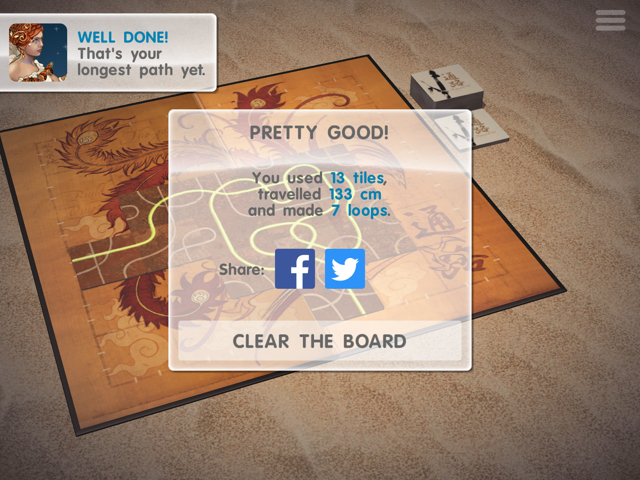
Now, while the “zero UI" philosophy helps bring a sense of immediacy between player and board, it also hinders the game’s competitiveness to a degree. For instance, there’s no good way to compare players’ loops or distance covered while playing the game, especially if you aren’t all looking at the screen at the same time. I would’ve liked to be able to see all those numbers even if they weren’t right on the screen but, rather, hidden in the options button. That goes for looking at the board at the end of a game; you can’t look at – or even take a screenshot – of the wonderful board when the game is over because a giant pop-up screen (with sharing options) covers almost the entire board. These are minor issues that can easily be fixed, and I hope they will be down the road.

And while the zero UI philosophy definitely extends to the board and the tiles, it stops short of inspiring the rest of the UI; the fonts used as well as all the other UI details aren’t up to par with the rest and really break the immersion and the illusion of playing the board game in real life. I really wish the rest of the UI looked thematically closer to the board and tiles because it’s a shame for a game so pretty to have such ugly fonts and colors. I know you might think I’m nitpicking – and to a degree, I am – but when you compare the board with the rest of the visuals, you’ll see what I mean. The good thing is that while parts of the UI aren’t up to par visually, everything is functional and works well.
As for the Facebook-only multiplayer, the big discussion point for many in our forums, it’s easy for us players to expect developers to give us all the features we want, but as Thunderbox pointed out in a post in the forums, the developer didn’t really have much of a choice. They considered going with Game Center, but that would mean having to redevelop the Android multiplayer part and also would mean the game wouldn’t have cross-platform multiplayer (and, after all, Game Center doesn’t work that well either).
The best they could do was go with Facebook, an option that would ensure the developers don’t end up having to shoulder costs down the line, especially since this is a pretty small studio. While I definitely wasn’t crazy about the Facebook part either, I understand where this decision came from, and as I said earlier, the game is more fun in face-to-face multiplayer anyway. Facebook login aside, the multiplayer experience is functional but not the best part of the game.
So, is Tsuro worth the purchase? Well, if you like board games that are pleasant to play and aren’t as complex as board games like Brass, Steam, or even Carcassonne, I would say definitely yes. The game is gorgeous (mostly), plays really well on mobile, and should be a nice gateway drug for those in your circle of friends or family who don’t care much about board games. For the completionists among you, the game offers over 50 achievements, and some of them are quite entertaining. The game costs $4.99, which is cheap for what it is and all the options it offers, and has no IAP shenanigans, so all those who decry IAP-laden games might want to check it out. If you like your board games with some wine on the side and a shot of zen relaxation, Tsuro should hit the spot.