I think everyone would pretty much agree that discoverability is the number one problem in the App Store, especially with Apple’s just-announced number of 1.2 million apps being currently available. There are other problems for sure, but right now as an app developer you pretty much have to cross your fingers that you’ll get some sort of feature position by Apple or that your app/game will do well enough to rise up the various iTunes charts so as to be more visible to the average iOS user. When your dedicating significant time and/or money into a project, its success depending on one of those factors makes creating an app a pretty big risk. There are plenty of great apps and games that fail simply because not enough people know that they exist.
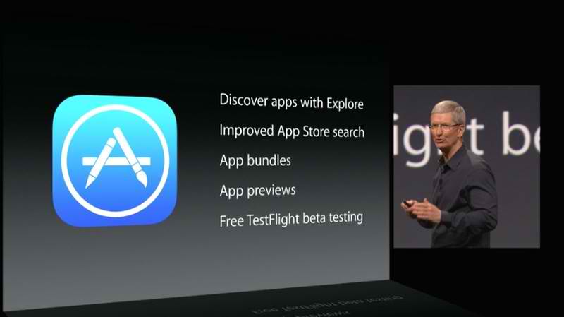
Apple seems to be aware of this problem, and today at the WWDC keynote presentation they unveiled several changes to how the App Store works in iOS 8 which should hopefully go a long ways towards addressing discoverability.
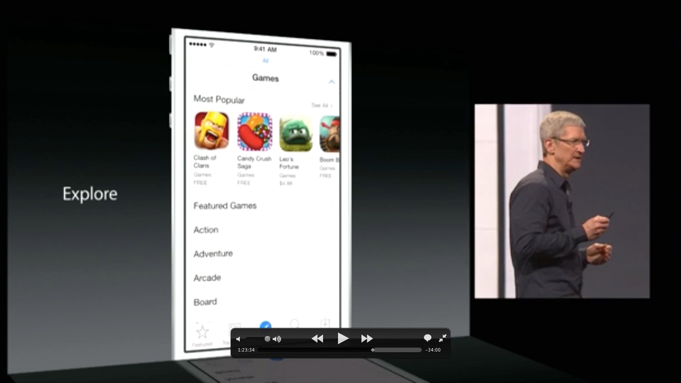
The first of these new features is something called the “Explore" tab, which sits in the bar at the bottom of the App Store app and appears to replace the “Near Me" tab that showed what apps other people were downloading in your area (seriously, did anybody even use that feature?). The Explore tab is basically a streamlined look at the different categories and subcategories of apps, which currently can only be accessed by choosing the Categories option at the top of the Featured tab. The Explore tab should put all the App Store’s different categories and all the top apps within them more front and center to anyone looking to browse for cool new stuff to download.
Another change in iOS 8 is an improvement to the Search tab that shows you what all the current trending searches are. I imagine this will be an interesting thing to check in on, much like looking at what’s trending on Twitter to see what people are talking about.
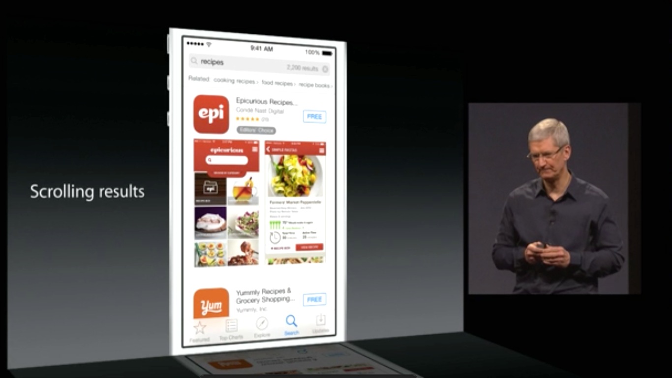
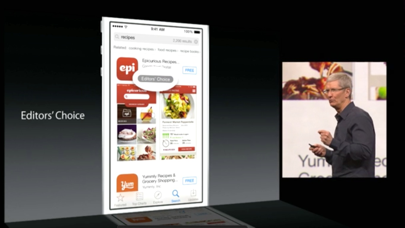
One new feature that I’m personally quite excited about is the new continuous scrolling search results. With iOS 7, I actually think Apple made search results more difficult to navigate as you were required to swipe sideways through each app result that showed up, with each app getting an entire page dedicated to it in the results. Needless to say, that could be a lot of swiping. It just felt oddly more clunky than the old way the results were shown, which was basically just a big list of app name and icons. With this latest change it’s sort of the best of both worlds. A downward scrolling list like the old days but with a bit more information and app screen shots mixed in. It looks really nice.
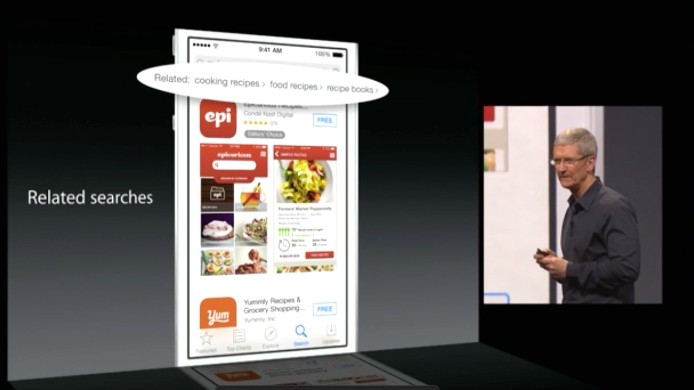
Related to that change in how search works is… uh, related searches. On the search results screen you’ll now find a bunch of different search terms that are related to the one you tried, just in case your search term didn’t return what you were looking for. In addition, there’s a new tiny Editor’s Choice icon next to any app’s icon that has been chosen to be an Apple Editor’s Choice before. This way, you know that those particular apps were good enough that Apple themselves highlighted them. Pretty cool.
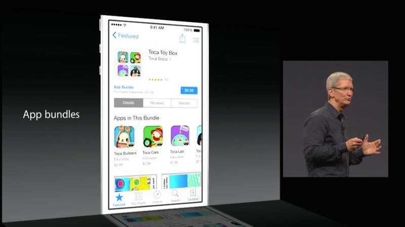
Finally, there are two pretty major new features that maybe aren’t necessarily related to App Store discoverability, but they should improve the overall buying experience for customers. First is the new ability to create App Bundles which feature a number of different apps and/or games sold within a single bundle for a discounted price. Bundles are huge on desktop computers and the Android platform, so it’s nice to see them coming to iOS. My one question is whether or not different developers can go in together to offer a bundle, or if it’s restricted to a single developer’s library of apps. Either way it’s a nice step.
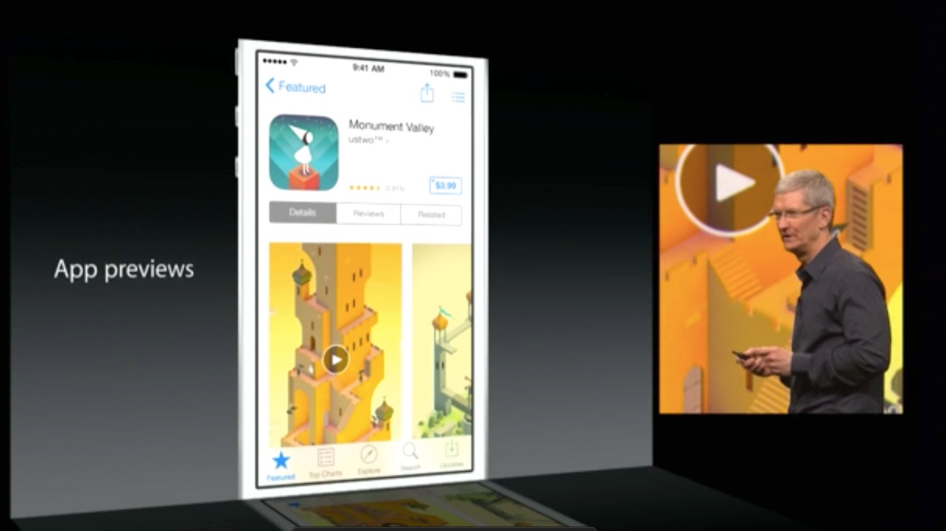
The second of these new features is something that’s been long-requested by developers and customers alike for years: video previews right from within the App Store listing. You might remember that Apple added a similar video functionality to the huge feature of Clumsy Ninja last November, so it’s not surprising to see them added in as a regular option. What is surprising is that it took so darn long for Apple to do this, but hey, I’m just happy they finally did.
So, those are all the major changes coming to the App Store in iOS 8, which is available in beta form to developers as of today and is set for a public release sometime in the fall. I’m very happy about all of these changes, and I’m anxious to see just how much they impact the discoverability problem developers have been facing for the past several years. If they can nip that in the bud, then we can move onto more of the App Store’s problems. In my eyes the next most pressing problem is the amount of poor quality apps being released, which includes a startling number of cheap knockoffs of more successful apps. So, what do you say Apple, any ideas on how to solve that one?
