 A fighting game developed from scratch for the touchscreen by an indie developer over the course of 4 years? Am I talking about the story of Kinetic Damage (Free)? Actually, no. By some crazy coincidence there’s another touchscreen fighter heading to the App Store with a similar development history. What are the odds?
This other indie fighting game is called Cool Clash, from the two-man team at Foxy Robot. Originally started back in 2009, and inspired by a love of playing Soulcalibur and an appreciation for the beautiful animations in Street Fighter III: 3rd Strike, Cool Clash looks like a labor of love through and through. I mean, you’ve got to really be passionate about something to work on it for 4 years, right?
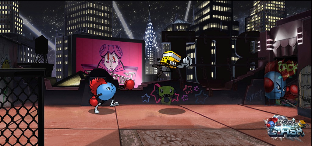
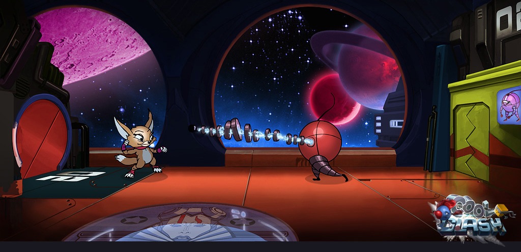
One of the reasons the game has been in development for so long is also one of the things that makes it stand out so much: the animation. Cool Clash‘s backgrounds and characters are all hand-illustrated and contain thousands of frames of animation. Seeing the game in action instantly brings back memories of real animation, you know? The Golden Age. Back before computers and software tools could do all the work for you, back when you painstakingly drew every frame of an animation until it looked just right. I love all the nifty new animation we have nowadays too, but this style of animation is classic. It’s timeless.
Cool Clash‘s other standout feature is its crazy controls. And I mean crazy as in crazy enough they might actually work. You have your standard left/right/down directional arrows for movement, but the jumping mechanic is quite interesting. Dubbed “dynamic jumping", where you’d normally find an UP arrow on the d-pad you instead have a sort of arched button. Where you tap on the button correlates to the angle of your jump, giving you a much greater range of jumping ability than the traditional straight up/diagonal forwards/diagonal backwards jumping in most fighters. It’s an intriguing idea, and I’m anxious to see how it actually works in practice.
The other half of the controls, the part that controls combat, is equally interesting. Here you can swipe towards the upper right for a heavy high attack, swipe towards the lower right for a heavy low attack, and tap for quick strikes. Swiping towards the upper left performs a throw, and towards the lower left blocks. Seems simple, but effective, and again might just be crazy enough to work. I’m not a big fan of the huge UI element in the upper right of the screen showing you which ways you can swipe, but that appears to be just a visual and not the actual buttons for the game, so hopefully you can just hide it.
Again, the controls sound like some really neat, fresh ideas on paper, but the proof will be in the pudding when I can actually get my hands on Cool Clash. As far as the visuals and animation is concerned though, I’m sold. Cool Clash should be submitted any day now and there’s currently a discussion in our forums and a development blog if you want to learn about its history, so keep an eye out for more in the near future.

