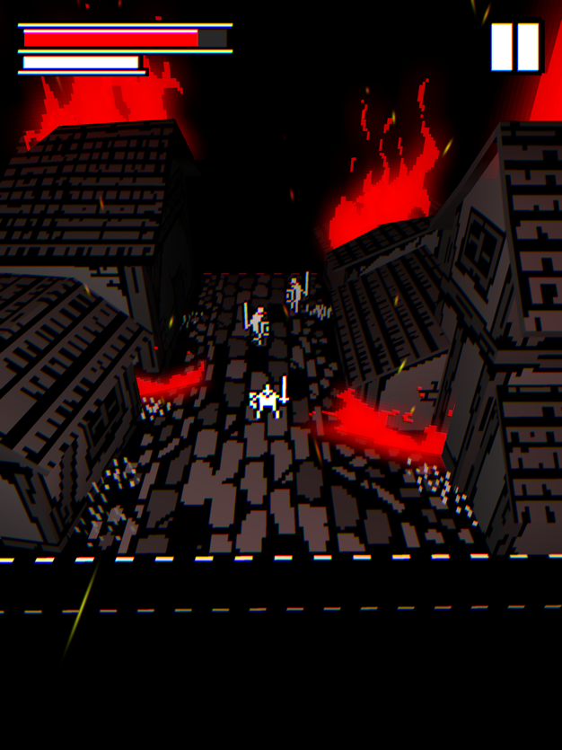
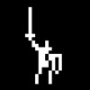
At first glance, Bleak Sword’s graphics look bad. Really bad. I’m addressing this right out the gate because this first impression has probably kept many players from giving the game a shot. The logo is literally just a stick figure with a sword and shield, for heaven’s sake!
Yes, the low-color sprites are supposed to look retro, and they do look retro. There’s nothing wrong with a retro look, but indie games have been doing the retro look for so long that it’s no longer a novelty. Plus, when you try to look as retro as Bleak Sword is going for, the graphics look bad first and retro second.
It’s a shame that this is the first impression that everyone will get of Bleak Sword, because beneath the bare-bones exterior is some of the best action gameplay that’s ever been imagined for mobile platforms.
The plot is about as bog standard as RPG plots get — there’s an evil immortal king, three magic stones, and prophesied hero, so go kill the bad things. It’s all told with a sense of foreboding and gravitas that feels a bit out of place at first. The slideshow cinematic that sets up the plot tells its classic tale of betrayal and woe using stick figures, and it’s hard to get invested in the fate of a kingdom when your first impression of a place is that it’s drawn by a five-year-old.
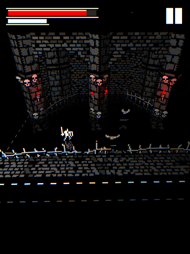
Yet the game pulls off something tricky as it shuttles players through its multiple various decaying, monster-filled environments: it begins to feel like it earns that gravitas. Its combat captures a sense of succeeding against all odds by the skin of your teeth, and it turns out that the art style is actually fairly effective once you look past the cave-painting-esque look of the player character.
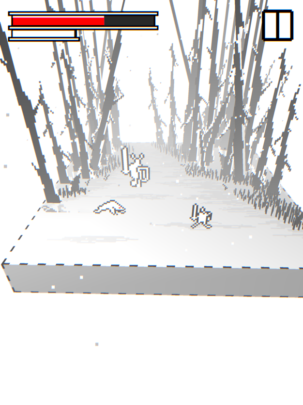
There’s a spattering of atmospheric lighting and environmental effects that hammer home the bleakness that the game’s title none-so-subtly points at, and the simple art has just enough detail to hint at the grotesqueness of the creatures while leaving enough to the imagination to let the players’ minds fill in the gaps. Add on top of this all some eerily fluid animation, and players could find themselves believing the story if they hadn’t already forgotten about it by the time they reach the end of the starting forest.
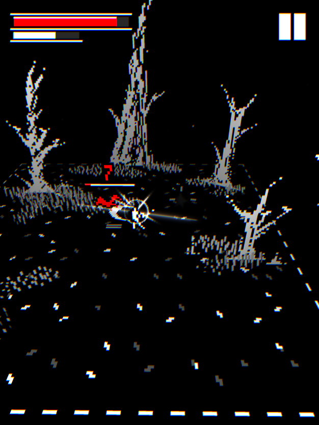
The boss fights make the best use of this style, with massive, intimidating sprites that dwarf the player and evoke a sense of fear as you mentally try to figure out what exactly it is that’s hunting you around the battlefield and trying to smash you like a pancake.
What’s frustrating is that a game doesn’t need retro art to achieve this effect. I get that indie game developers like more8bit might not have the budget to spring for high-fidelity character designs, but I can’t shake the feeling that if the game didn’t star a pixelated stick figure knight, it’d have become a huge hit that people simply wound’t be able to stop talking about.
Simply put, the way this game plays a smartphone is masterful. It has a tense dodge/parry/counterattack rhythm that mimics Souls-like games, while limiting the action to smaller, static stages. This helps emphasize the game’s greatest strength: its ability to draw players in and make split-second decisions about how to best handle whatever collection of foes they’re facing down at the moment.
Players can only move around by swiping the screen to make quick dodge rolls. This would get annoying if they had to explore large, sprawling levels, but when the main concern is smaller battlefields, the system becomes second nature.
The game knows how to mix things up in a way that keeps its central mechanic from growing stale. Every few stages it brings out new enemy types that all need to be approached with different strategies to avoid taking damage, and they all hit hard enough to make players want to avoid their attacks. The environments also change regularly, with each place offering its own hazards that affect both the player and foes alike, giving players the chance to be clever in how they defeat their foes.
The game offers both a one-handed and two-handed control scheme, but it really shouldn’t have bothered with that. The one-handed control scheme features a clever and intuitive way to mix moving, dodging, parrying and attacking into a series of easy-to-remember single-finger inputs. The two-handed scheme, meanwhile, is just the same controls, but half only work on the left side of the screen, and the other half work on the right.
I get that they’re trying to make things less-daunting for people who are used to playing with a gamepad, but a smartphone isn’t a gamepad. The sooner that mobile games stop pretending that phones are gamepads, the sooner we’ll start seeing games that work with a phone’s touchscreen instead of against it. Bleak Sword, at least in one-handed mode, is one of those rare games that works with a touchscreen, and it does a marvelous job of it.
There are things that the game could do better — like less-linear stage progression, a story that’s more than just an afterthought, and a few bug fixes spring to mind. But it’s rare to find a mobile game that embraces its platform as well as Bleak Sword, and I encourage anyone with an Apple Arcade subscription to check it out.
I still think it could do with some better graphics, though.
We pride ourselves on delivering quality, long-form articles like this one instead of the SEO-driven click bait that is slowly taking over the internet. Unfortunately, articles like these rarely generate the traffic (and as a result, the ad revenue) of listicles, cheat guides, and other junk.
Please help us continue producing content like this by supporting TouchArcade on Patreon, doing your Amazon shopping by first visiting toucharcade.com/amazon, and/or making one-time contributions via PayPal.
NOTE: Bleak Sword is available on mobile exclusively as part of Apple Arcade, a premium gaming subscription service from Apple. Without being a subscriber to Apple Arcade you cannot download and play this game. Apple Arcade is $4.99 per month and does come with a free one month trial, you can learn more about it on Apple’s official website or by visiting our dedicated Apple Arcade forum.
I disagree completely about the graphics. There’s beauty in its simplicity.
I wholeheartedly agree. The graphics were effectively the one thing that made the game stand out from the crowd at first look, having this unique „low-if but 3d“ effect.
Quite the opposite, if the game didn’t have the reduced aesthetic, it would have looked like „more of the same“.
Plus, the simple graphics produce really strong impressions, and fit the simplicity of the input method. With simplicity being meant as a virtue; The game consistently avoids adding unnecessary cruft.
This extends to the story, which mostly just get‘s out of the way of the gameplay loop.
it's not even just simplicity; this art is phenomenal. just cause the reviewer doesn't like the style doesn't make the art bad. this is a classic case of someone not understanding what they're looking at and thinking it's bad cause they're ignorant.
Graphics aside, I found iPadOS‘s support for the Xbox One controller a great match for this game. Even though touch input is well done, nothing quite beats a proper controller for beat em ups.
I agree though that they found a really good way for the touch screen. Using swipe gestures this directly easily beats using an emulated analog stick. Even though modern „first point touched is the center“ analog emulation beats older „fixed position“ inputs easily.
Ironically, one of the first mobile games I’ve played was the now defunct iOS version of Mirror‘s Edge. It likewise used swipe gestures for input, and didn’t require awkwardly avoiding to slide off some emulated button.
Even now, most games require keeping the thumb pressed down to keep moving, which feels quite awkward when lacking the haptic feedback off a thumb stick's spring. Worse yet are games with a „click to move“ mechanic, where your finger gets in the way of seeing the most important part of the screen.
Well said.
This review is honestly kind of rude. I get that a lot of people aren't fans of pixel art, but the developer clearly put time and effort into it, and for the reviewer to describe it as "drawn like a 5 year old" and "cave-painting-esque." I mean, if you don't like low-fi pixel art, just say that, you don't need to insult the artwork repeatedly.
As a pixel art lover myself, I definitely expected some comments about the graphics, but I also think the criticisms in the review were intended to be more tongue in cheek than people are taking them as. Like in a "can you believe a game that looks this simple has such complex and interesting combat?" sort of way.
That's a fair point, I can see it being read that way in the writer's head and maybe not necessarily coming across to me reading it. I guess I just feel that there's definitely a lot of skill that goes into even low-res pixel art, and for sure a difference between a game looking simple as a stylistic choice versus straight-up looking bad!
A great game is a sort of balance act to mix great gameplay with good graphics in this case the graphics are a bit of a letdown.
you shouldn't be allowed to review games anywhere for anyone if you start this review with "da grafics are baaaad durrr'.
you are insufferable and you know nothing about art.