 When we heard earlier this month that Samurai Shodown II was heading to the App Store, I got all tingly with excitement. I’m a huge fighting game nerd ever since the original Street Fighter II in arcades more than 20 years ago, and although I’m terrible at them compared to elite players I still thoroughly enjoy all the different types of fighting games that have graced us over the years.
One of the coolest fighting games when I was a kid was Samurai Shodown. It introduced swordplay into the fighting game formula, and also featured a dynamic camera that would zoom in and out of the action as necessary, creating a dramatic effect during fights. Its follow-up, Samurai Shodown II, expanded and enhanced everything from the first game, creating arguably the standout entry in the series.
And now you can get it on your iOS device. Is that a good thing? Well, that’s all going to depend on your general feelings towards touchscreen fighters. When a fighting game is designed from scratch for the touchscreen, like the sublime Kinetic Damage (Free) or even something like Infinity Blade II ($6.99) to an extent, it can be a fantastic experience. But the majority of iOS fighters are some type of port with virtual buttons plastered over the top.
That’s not such a bad thing, as virtual controls have come a long way over the years, but it’s the sort of thing that you either do well with… or you don’t. Samurai Shodown II has great virtual controls, on par with those in Capcom’s Street Fighter offerings or even SNK’s own King of Fighters games on iOS. If you do well with other iOS fighters you’ll be just fine here, but if you don’t then there’s nothing in Samurai Shodown II that’s going to change that.
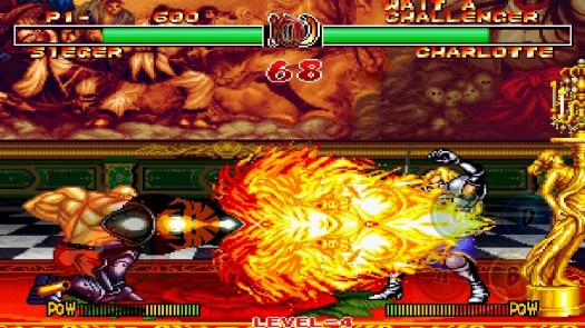
Anyway, with all that out of the way, the actual port of Samurai Shodown II is excellent. DotEmu has thrown in a bunch of cool features that you’ve likely seen in their previous SNK ports, like the ability to toggle graphic filters and scanlines, play in original, windowed, or widescreen aspect ratios, and completely customize the virtual button size and placement. The game looks and plays just as smoothly as it did in the arcades, and I’d argue looks even crisper and cleaner than the original due to iOS’s superior screen.
One thing that has been tricky so far is that Samurai Shodown relies heavily on pressing multiple buttons at once to pull off certain moves. This is mitigated somewhat by a 6-button option which adds dedicated A+B and C+D buttons into the mix, but it’s still far from ideal. Also there’s no option to manually change the opacity of the virtual buttons, though they do cleverly auto-fade away when you’re using them and then slowly fade back in when you’re not. It’s a neat feature, but I’d still prefer to adjust their visibility on my own.
Samurai Shodown II is pretty much what I expected it would be – a great port of the original that is difficult to play with virtual buttons. Still, I look at most of these fighting games as more of a novelty than anything, and have generally enjoyed them for what they are. If you share a similar line of thinking I think you’ll enjoy Samurai Shodown II and will appreciate having it in your pocket at all times. If you’re looking for something that redefines fighters on a touchscreen, well, maybe skip this and give Kinetic Damage a try first and go from there.
Either way, add Samurai Shodown II to your TouchArcade (Free) app and we’ll send you a push alert when it hits the US App Store later tonight, and you can find further impressions from players in our forums, who seem to be enjoying the game so far.
International App Store Link: Samurai Shodown II, $9.99 (Universal)
