 I certainly do enjoy when a game provides its own pun, especially when the pun actually checks out in all respects. Type: Rider‘s ($2.99) clever, descriptive title is not only cute, but also the first sign of the deliberate care and design to come for the player. The game, which more or less is about riding type, has some of the finest design I’ve seen in a long time, with a constant barrage of new tricks and some details so subtle that you won’t even pick up on them the first time through. It’s also quite informative, particularly for someone like myself who knew very little of the history of type. It’s like a beautiful, clever, interactive documentary, and although it stumbles a bit due to some technical issues, the end result is a wonderful, if sometimes aggravating, experience that I’d recommend to anyone.
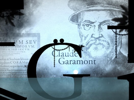
Type: Rider takes you on a journey through the history of typography in which you play as two balls that likely represent a colon, but could also be an umlaut, I suppose. The game is broken up into ten worlds, each one representing a particular era and using a particular font as a theme. The levels themselves are primarily composed of letters from that font, and you’ll need to roll and jump your way through them while picking up letters of the alphabet and asterisks. Upon picking up an asterisk, you’ll unlock some reading material that fills you in on some of the history connected to that particular world’s font and era. Somewhat ironically, the spacing of the text in these readings is sometimes messed up, and typographical errors abound. Nevertheless, the readings are interesting and informative, so I can forgive a few misplaced apostrophes and spaces.
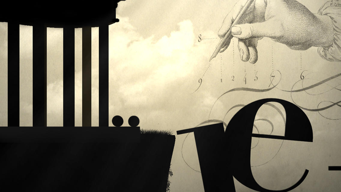
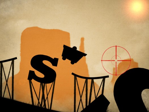
The worlds themselves are absolutely stunning, each with their own unique theme reflecting the feel of the era and font. Naturally, this goes for the visuals, but it goes for everything else as well. The tutorial level, covering the earliest periods of writing, has you coming from a dimly-lit cave with paintings on the wall and only the ambient sounds of dripping water, leading into rooms that open up as instruments and sound effects weave in and out, reflecting the Egyptian hieroglyphics, Chinese characters, and more. In the world covering the Old West time period, after introducing the font used on wanted posters, you take a wild mine cart ride through a sepia-toned world, while cross-hairs try to get a bead on you and finish you off. The last world is an absolute treat for fans of gaming, and don’t even get me started on the secret level, which uses Comic Sans as its font theme.
Each world is usually broken into four levels. Two of these levels largely involve traversal from one side to the next, while the other two are more puzzle-type levels where you have to guide a white ball to a lock that opens the door to the next area. The puzzles aren’t very hard to figure out, but they’re all unique and appropriate to the theme, just like the traversal levels.
The sheer number of things this game hauls out to use just once is boggling, and you’ll still be thinking about how cool the last gimmick was when the next one hits. While I typically break up my game playthroughs into very small chunks out of necessity, I found myself pushing through the six or so hours of this one in about three sittings, simply because I was genuinely excited to see what the developers would throw out next. I could spend the rest of the review gushing about all the stuff I saw in this game, but it’s best experienced in the moment, so I’m not going to spoil anything more.
Your character controls like two rigidly-connected spheres, though the gap between them isn’t solid, allowing objects such as platforms to get between them. The game gives you three control options, and each of them generally works as well as the next. You can choose from tilt controls for all the crazy people who like those, virtual controls, and a control set-up called “intuitive", which is what it says on the can, having you push the right or left side of the screen to roll in those directions with a tap on the opposite side causing you to jump. For the most part, the controls are fine, but jumping in tight quarters can get a bit messy thanks to the odd shape of the protagonist. At these times, I had to take a minute and remind myself to take it slowly and carefully instead of just trying to twitch-jump my way through.
You are going to die very often in Type: Rider. Sometimes it will be because of a well-designed challenge, but more likely, it will be because of unpredictable outcomes due to the unfamiliar physics of controlling this type of object. It can be very frustrating because what you need to do often looks so simple, but getting things to work out the way you would like them to is harder than you’d expect. The last level proper had me howling and punching my pillow in a couple of spots. Luckily, the game checkpoints very frequently and instantly puts you back in the action when you die, which mitigates the suffering a little. What adds to the suffering is how buggy the game is in its present form. It’s occasionally crash-prone, especially when big objects are working, and sometimes the menus completely glitch out, forcing a manual restart which puts you back to the start of that sub-level.
In spite of these shortcomings, you absolutely must play Type: Rider. I don’t care if you aren’t interested in typography, because it doesn’t matter. It’s an intricately-designed masterpiece that constantly throws fresh challenges and situations at you for the entire run of the game. It looks fantastic, it sounds gorgeous, and it’s packed full of imagination and an infectious love of not only typography, but of gaming as well. You might suffer a little at times, but the experience is more than worth the pain.


