 It’s been a little over a week since Stardew Valley ($4.99) arrived on iOS and the productivity level of millions of people around the world plummeted. Yes, bringing a game that’s this life-sucking to a device that you can take with you everywhere was a cruel trick indeed, but I can’t thank the developers enough for doing so. About the only caveat with the mobile version of Stardew Valley was that the game’s default tap-to-move control scheme was not to everyone’s liking. Especially on the iPhone where things were much smaller and “fat-fingering" an incorrect action could be really frustrating. Well, original developer ConcernedApe and publisher Chucklefish have earned quite a reputation for taking in player feedback and being extremely responsive to it, and now the company that they recruited to port Stardew Valley to mobile The Secret Police is following in those same footsteps. Just prior to the game’s official launch the mobile developer responded on Reddit that new control schemes were in the works, and today we have our first look at just what those are. And boy howdy are there a lot of options coming. As outlined on the official Stardew Valley wiki page:
Tap-to-move & Attack Joystick
This is the default tap-to-move control scheme but rather than have you auto-attack when confronting enemies in the mines, with this option a special attack control stick will pop up when a weapon is selected and you can drag in any of the four cardinal directions to swing the weapon.
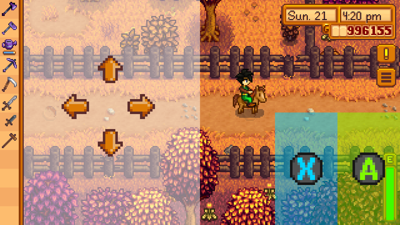
Invisible Joystick & 2 Buttons
This is by far the control scheme I’d hoped most would be implemented into the game. Basically the left side of the screen is a big invisible joystick that will center itself wherever you place your thumb. On the right side of the screen are two simple virtual buttons, with zones that extend well past the actual button itself as seen in the screen below, that act as “use tool" and “perform action" buttons.
Invisible Joystick & 1 Button
This is for the supreme minimalists out there. You get the same left side of the screen invisible joystick as in the previous option, but rather than two virtual buttons on the right side of the screen the entire right side of the screen itself is just one big button that does double duty. A quick tap on that side will trigger “use tool" and a longer press will trigger “perform action."
Tap-to-move + Joystick & Buttons
This is for those who want it all. It’s the virtual stick and buttons option but ALSO tap-to-move works everywhere except if you tap on the virtual controls. There will also be a variation of this option that only brings up the virtual controls when a weapon is selected, and one that is tap-to-move with a virtual stick for movement only and no buttons.
I mean, did these guys go overboard or what? I can’t imagine anyone thinking of a control scheme that isn’t included in the ones up there, unless some maniac out there wishes for a tilt-to-move scheme. There will also be a new option to toggle a button on the screen that allows you to show and hide the controls on a whim. When you enable it it’ll display whatever control scheme you have selected from the options, but when you disable it it’ll switch everything to the default tap-to-move and auto-attack controls. No word on when exactly this update will be coming, but it sounds like it’ll be fairly soon.
