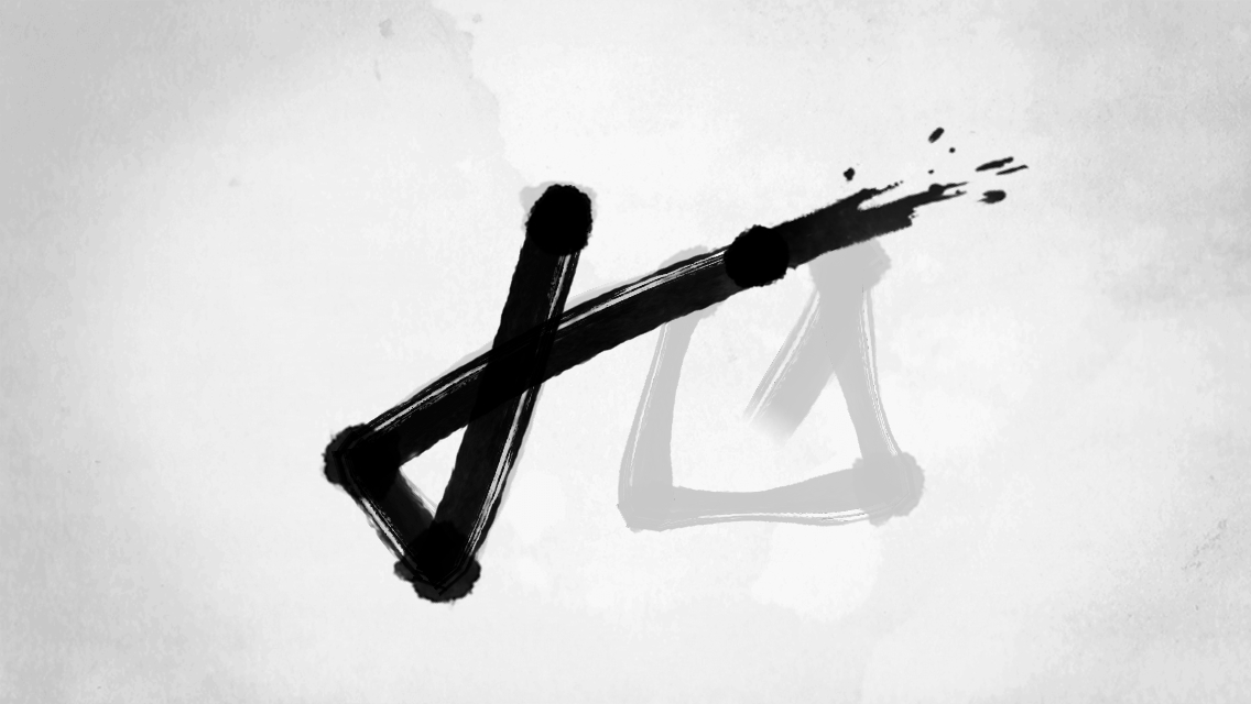
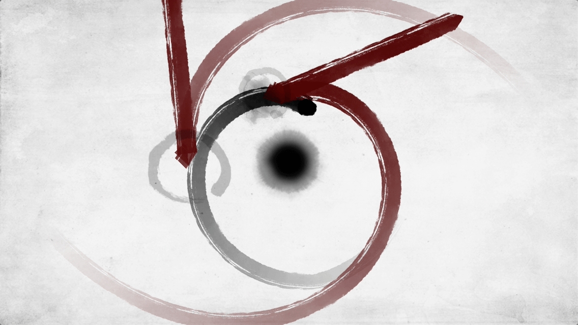
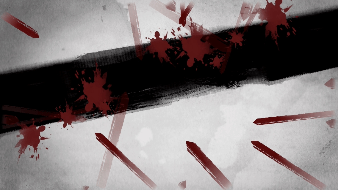
 The Swords ($1.99) is an interesting little experience because it’s this mixture of gorgeous art and animation combined with gameplay that’s fun but sometimes frustrating. The story that sets up The Swords is that a master of swords is telling a story about his grandmaster, an expert swordsman proficient in many different types of swords, and the very idea of them. Microgames wind up comprising the gmaeplay here, as you perform sorts of different actions through swipes and taps depending on the section of the game you’re in, so that you can progress. You’ll be swiping to deflect enemy swords, utilizing a spinning sword to deflect enemy blows, controlling the sway of a tree in the wind, and more. You kind of get to do anything and everything sword-related here.
The Swords‘ greatest strength is by far its artistry. The entire game is rendered in watercolor-style visuals not unlike Blek ($4.99) but with only black and red used on a white background. The game uses abstract visuals in the game to convey all sorts of situations, and it works. Everything toes the line between trying to be simple, abstract representations and not losing sight that this is a game about swords, even though the representations wind up being these far out things at times. It’s a style that’s actually quite subtle but rather distinctive. Tonally, the game winds up having this serene and reverential atmosphere that feels great.
Now, calling a game’s greatest strength its artistry can feel like a slight, but I assure you that it is anything but that. This game is about being a vehicle for showing off its world and atmosphere that it’s creating, and it does an exceptional job at that. And I think especially in this age where we have limitless numbers of games and titles that cost fractions of what they once did, there’s nothing wrong with being an artistically-focused experience. That’s not to say that the gameplay is subpar here – it’s imperfect, but it’s secondary. The play serves the artistic experience.
But while The Swords is beautiful, the gameplay is imperfect. The core issue is that its difficulty is wildly uneven. The game introduces new elements throughout as you play, but eventually the challenges peak at particularly difficult sections that serve as a roadblock to enjoyment.
One portion of The Swords has you swiping a giant line to hit all red swords on screen at once, and that’s difficult enough as is, because the timing is odd. As you swipe, everything goes forward in time faster than they’re moving on screen. So, you kind of have to predict where everything is going to be, but you can be just off with the dozens of swords on screen to hit. It’s not entirely intuitive. And then you have to do a sequence of three of these in a row, completing them without failure. And sometimes the game flips directions on you, perhaps to keep you on your toes, but it’s just annoying. As well, when the game throws invisible sections your way, forcing you to memorize and keep track of where certain red swords are based on limited information, it becomes difficult to play with, and not always fun. And that’s the problem: The Swords becomes a real drag when you hit a problem point. And the game, while clever, struggles to overcome when you get stuck at these frustrating points, especially when you have to repeat things that are pretty tough to accurately do in the first place.
The Swords seems centered around the idea that all sorts of gameplay methods should be represented here, taking you on a whirlwind tour of them, but some ideas feel strong enough to be their own games. The spinning sword where you tap-and-hold to extend the radius of your spin would be a fun high score chaser game on its own. Even some of the grab bag sections of the last part of the game wouldn’t be out of place in something like Last Voyage ($3.99), perhaps the closest analogue to this game. But it’d be great to see some parts of this expanded into replayable sections in a later update. Right now, you can play on higher difficulties and replay earlier sections, but that seems to be it.
The game’s user interface could easily be the kind of game that decides to use no words at all, and that would be a bit easier for localization, I imagine, but thankfully it instead uses words to indicate difficulty and menu options! You would think this would be the kind of game that would go for something abstract, though text is used in the story. I’m glad this bucks that trend.
If the art of The Swords intrigues you, then you will likely enjoy this, as a vessel for the gorgeous watercolor and charcoal-inspired art. The game itself gets in the way at times of enjoying the art, but otherwise, The Swords is a worthy experience.


