 I’ll put my cards on the table: I wasn’t a fan of the Boss Monster card game. I was heavily in to Magic: The Gathering back then and a few of the guys in our club went ga-ga for Boss Monster and threw some cash in to the Kickstarter, but it never grabbed me in quite the same way. Yes I liked the retro theme and the pretty 8-bit art, and it’s a cool idea to play as the baddy, but every time I played it struck me as one of those card games that has a lot of stuff going on, but not much happening.
When I heard about the iPad version, for some reason it appealed to me, in that finger-rapping why-isn’t-it-here-already kind of way. I thought Boss Monster would make a better single-player tablet game than it does a tabletop card game.
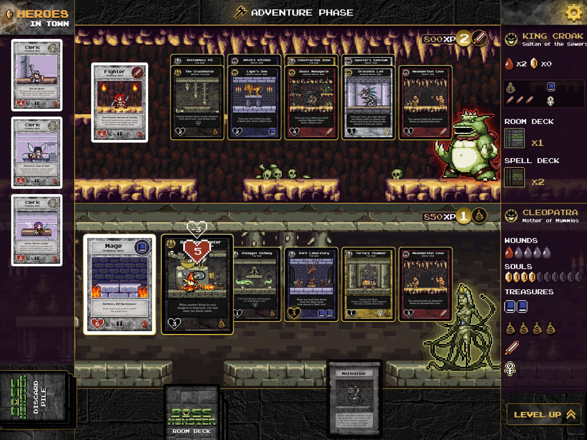
The core game mechanic involves building rooms, which contain either traps or monsters, and then luring a “hero" in to them. Each room deals a certain amount of damage to the hero. As the game progresses you can build advanced rooms on top of the basic ones, and these do more damage. If a hero survives your devious chain of rooms then he reaches you, the boss monster, and wounds you. Five wounds and you lose. But if your rooms do enough damage to kill the hero then you collect his soul. Ten souls and you win.
Each room contains a certain type of treasure, and different heroes are only interested in specific treasures. So you have to design your chain of rooms around doing enough damage to kill heroes, but also having enough treasure to tempt them in the first place. It’s this balancing act that largely decides who will win or lose.
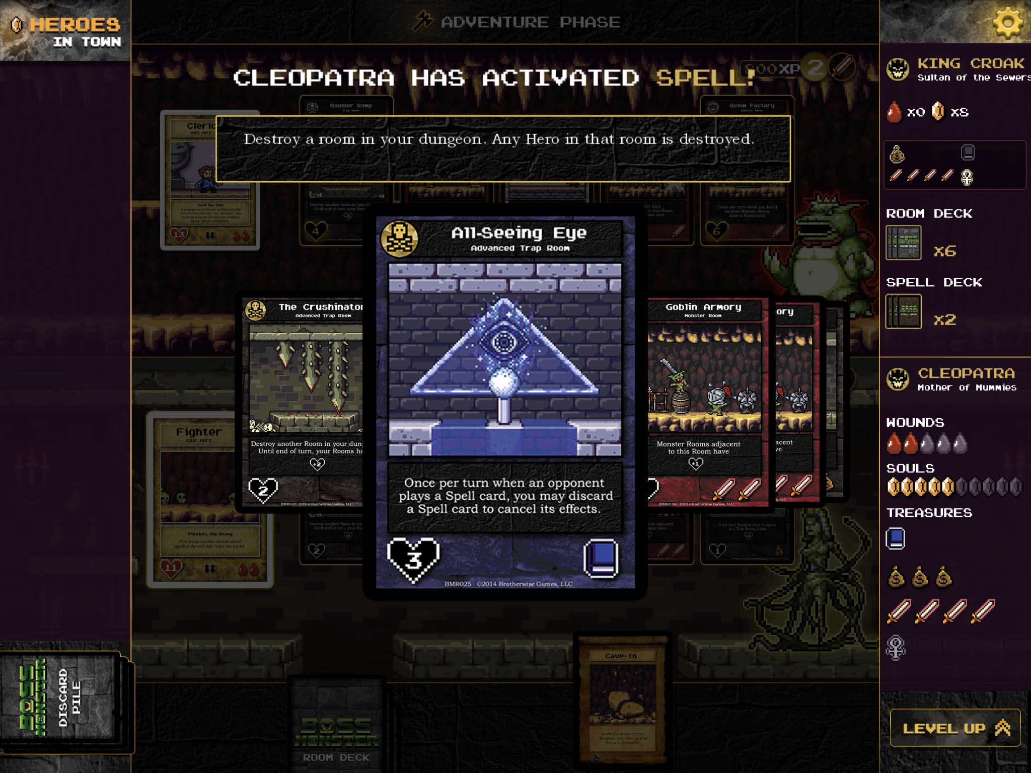
There are spells that you can use to help yourself, such as giving a room a one-turn damage bonus if you realise a hero is going to survive it. Other spells hurt your opponent, for example giving a hero a health boost to help him get through your opponent’s rooms. Rooms themselves can have special abilities, such as allowing you to destroy the room and kill any hero that’s inside it.
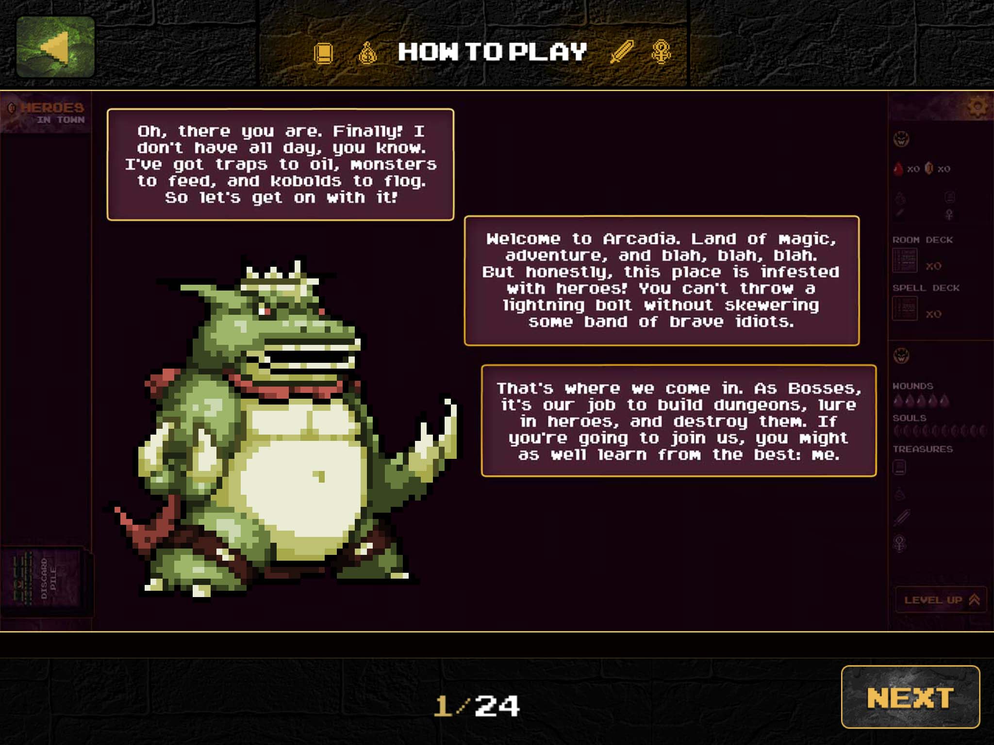
If you’ve never played Boss Monster the card game then the iPad version isn’t exactly welcoming with its 24-page tutorial. This really should have been done as an in-game tutorial to ease new players in gradually.
There are a lot of interface issues too. For example, when you receive a new card, it briefly flashes up on the screen and then gets hidden away face-down in your deck, so you have to open your deck and find the card to read what it does. Why not leave the card visible until you tap to dismiss it?
It’s also a strange choice that the game only allows you to see either your room cards or your spell cards, but not all at the same time. Perhaps this is an attempt to emulate the way people play the game in real life, keeping their two sets of cards face down and then only picking up the cards they want to look through. But there’s no reason for a video game to adhere so rigidly to the real-world version.
The iPad’s screen space could be better used. The interface looks lovely and it’s all very neat and cosy with beautiful retro graphics, but more space should have been allocated to the room cards seeing as they’re the most important part of the game. Just because it’s an iPad and developers have got acres of screen space to work with, that doesn’t mean they should waste it.
Even the way you play the game is badly thought-out. Cumbersome would be a good word to describe the Boss Monster interface.
Suppose, for instance, you want to play a spell on one of your own rooms, the one where the hero is. You select the spell and then tap the room, yeah? No, that would be way too user-friendly. Instead the game hides the entire play area with cards representing you and your opponent, and you have to select which one controls the room you want to apply the spell to. Once you’ve made your selection, and still keeping the play area hidden, the game shows you a scrollable carousel of cards representing the rooms belonging to that player. By this point you’ve probably forgotten which room the hero is in. And if you’ve got two copies of the same room, and the hero’s in one of them, then good luck selecting the correct one from the carousel.
There’s more. When casting a spell it’s really easy to select the wrong player, but there’s no way to change your mind. So you intend to give one of your rooms a +3 damage bonus, but you click on your opponent by mistake. Then the game shows you a list of your opponent’s rooms, and you have to pick one. No way to go back, no way to cancel.
I don’t know how a development team that’s capable of producing such a high-quality game could also leave it saddled with such disengaging interface issues. The whole thing has the stench of some clueless middle-manager sticking his beak in, insisting that everything should be dumbed down. Boss Monster is a card game designed by nerds for nerds, but the iPad version feels more like it has been designed by committee for children.
The game is free to download and play in single-player mode, and even with the interface issues you’re actually getting a decent game for nothing. If the developers decide to rethink the interface then Boss Monster‘s single-player campaign will be the iPad steal of the year. Even a single-player expansion of 40 additional heroes can be unlocked just by winning games, no payment necessary.
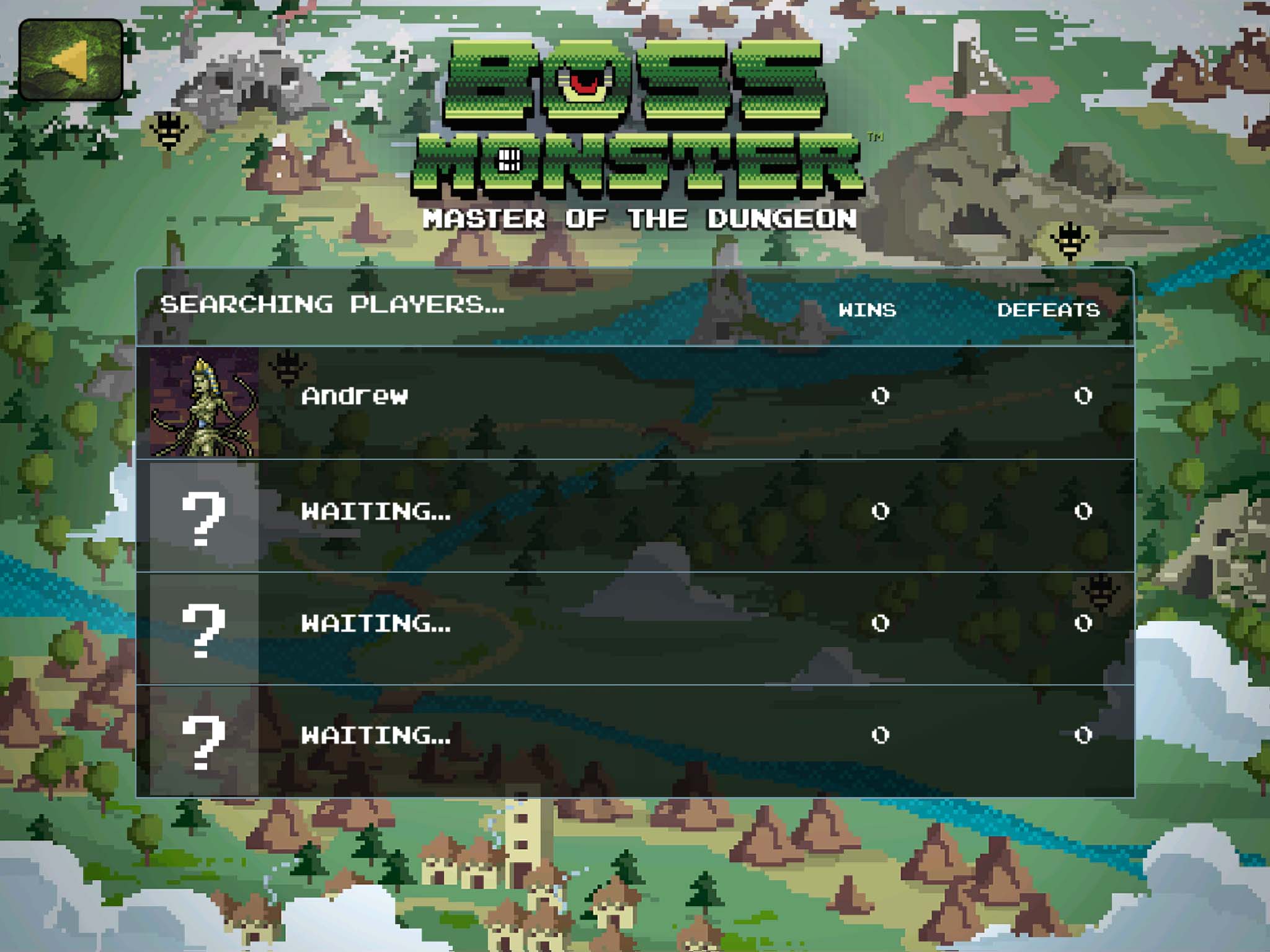
You’ll need to hand over $6.99 to unlock the multiplayer component, and I don’t think many people are doing that yet because I’ve not seen a single other person listed on the worldwide server. Maybe that’s because of a bug that prevents you from completing the in-app purchase, although you can get there with some persistence by terminating the app and trying again. There’s also a pass-to-play option, where you take your turn and then hand the iPad to your opponent.
I’m inclined to say that you shouldn’t let the interface issues put you off, but really that’s your call, not mine. Personally I can get past the clunky interface and enjoy the game, and I’m rating it with that in mind. There’s a great single-player game here, and I still think Boss Monster is better on a tablet than it is on the tabletop. I’m certainly hoping for an update to fix the interface though.
If you actually remember “retro games" from the first time round, when they were just “games" and we didn’t know they were retro yet, then Boss Monster will surely rekindle some fond memories from your youth. Remember getting home from school, closing your bedroom door and disappearing in to some 8-bit pixellated world for a few hours? Boss Monster gives me that joyous feeling again, and for that reason alone I love it.
