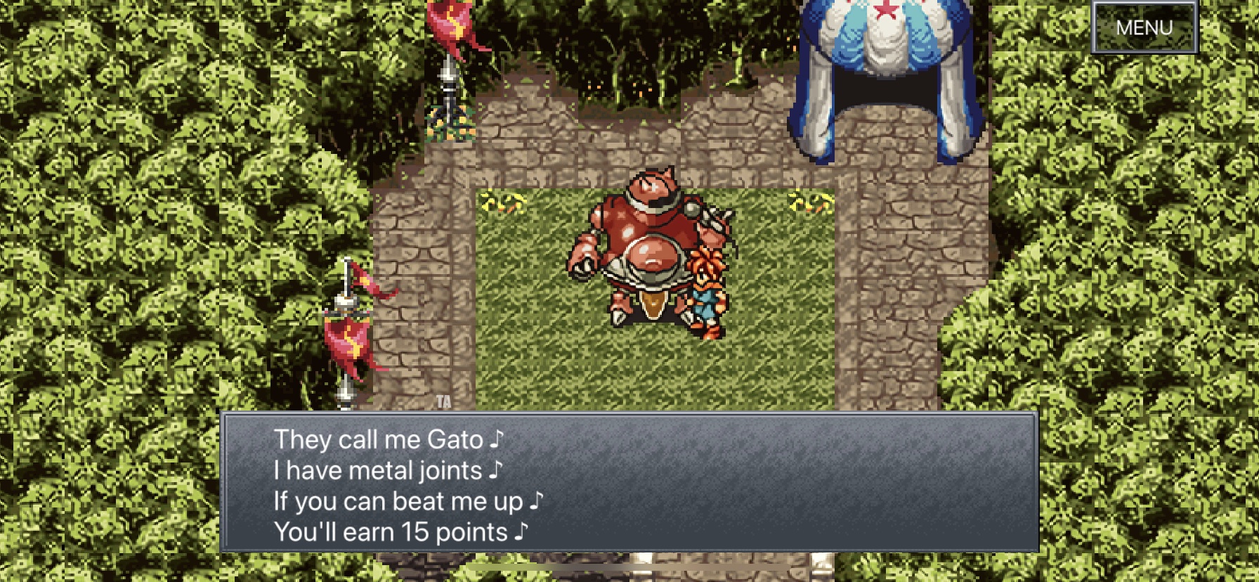
 Yesterday, Square Enix announced a major update for Chrono Trigger ($9.99) on iOS, Android, and Steam that was scheduled to release on March 11th. This update promised many new features and fixes, but I was mostly hoping that the ugly filter would be addressed on mobile. If you’ve not kept up with Chrono Trigger on mobile, it was downgraded with its “Upgrade Version" when it arrived on Steam. The Steam version’s visuals were fixed eventually, but iOS and Android users have been stuck with the filtered look. The major update has gone live earlier than expected bringing in the extras menu (that you can use when you have completed the game), widescreen support, auto battle options, and more. The mobile version still doesn’t include the “original graphics" option from the Steam version. The screenshot below is how it looks on iPhone 11 now:

It is disappointing to see Square Enix still not give Chrono Trigger on mobile the care it deserves. Barring my issues with the visuals, the new features are welcome additions and will make replaying it better. Now that this update is out on mobile and likely going live soon on Steam, I hope Square Enix can get the visual options added. I’m hopeful that potential future console versions don’t launch like this. If you’re ok with the look and don’t own it yet, you can buy Chrono Trigger for $9.99 on mobile and $14.99 on Steam. Check it out on the App Store for iOS here, Google Play for Android here, and Steam for PC here. Have you played Chrono Trigger on any platform yet?