 Football Manager Touch 2017, Sports Interactive’s classic football (soccer for some of you) management game, was one of my top 10 games of the year despite some serious technical issues that led to plenty of crashes. Those issues aside, though, the game was a fantastic and deep sports management game that had no equal on the App Store. Enter Football Manager Touch 2018 ($19.99), the latest in the series. FMT 2018 sticks to what made FMT 2017 so great—a more accessible version of the PC version of the game but deeper than the handheld one—and makes little changes that go a long way toward making the game easier to play on a tablet. With an improved UI and the same addictive gameplay, FMT 2018 is another jewel of a game that I will spend too many hours playing.
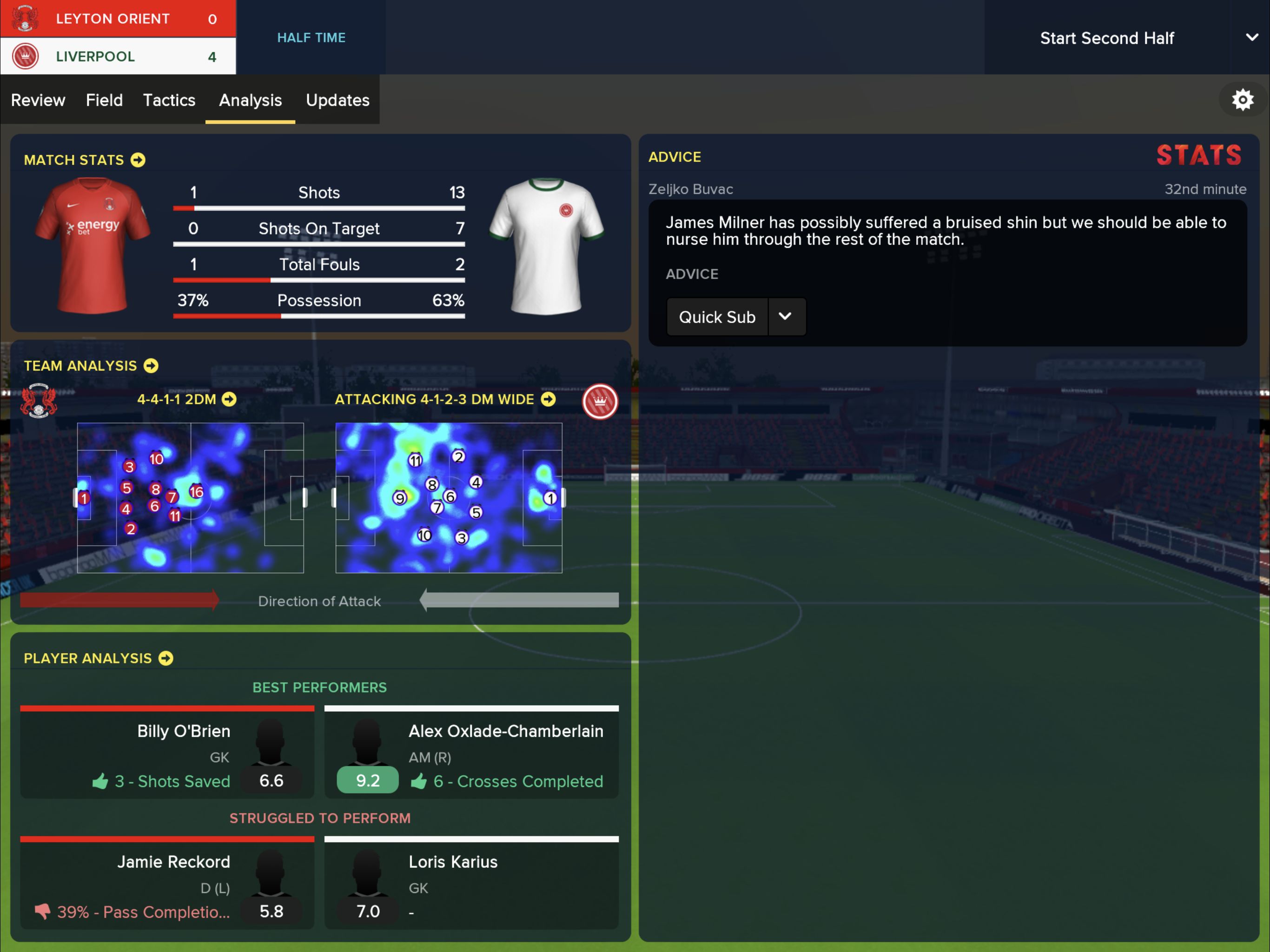
For those who’ve never had the pleasure of playing this series, FMT 2018 is the slightly more accessible version of the PC game Football Manager 2018, which in turn is possibly the most detailed sports management game out there. FMT 2018 has you picking a team from any of the 130 leagues included in the game and trying your luck, be it leading that team to glory or getting sacked within 2 months. The game has a huge database that includes everything you ever needed to know about all the players from the game’s many leagues. And we’re talking details ranging from physical and mental attributes, relationships with other players and coaches, history, and so much more. All those details humanize your players, which—along with how they’ll often behave like spoiled brats—helps create the feeling that you’re indeed managing and playing against humans rather than spreadsheets.
As I always do when I play Football Manager, I picked Liverpool because it’s a good enough team to make the game fun but bad enough to make it challenging. FMT 2018 does a great job easing a player into the game by giving plenty of pop-up information and tooltips for those who need them as well as allowing players to delegate parts of managing to parts of the staff. For instance, I didn’t want to bother with the training regime of every single player, so I had my assistant coach take care of that. If I want to try and help a specific player improve, I can go into the Training screen and do all kinds of adjustments. FMT 2018, like its predecessor, manages to make the complex accessible and allows players to assume the amount of control they want over their squad, which is great because, otherwise, FMT 2018 would be inaccessible to anyone not already familiar with the franchise.
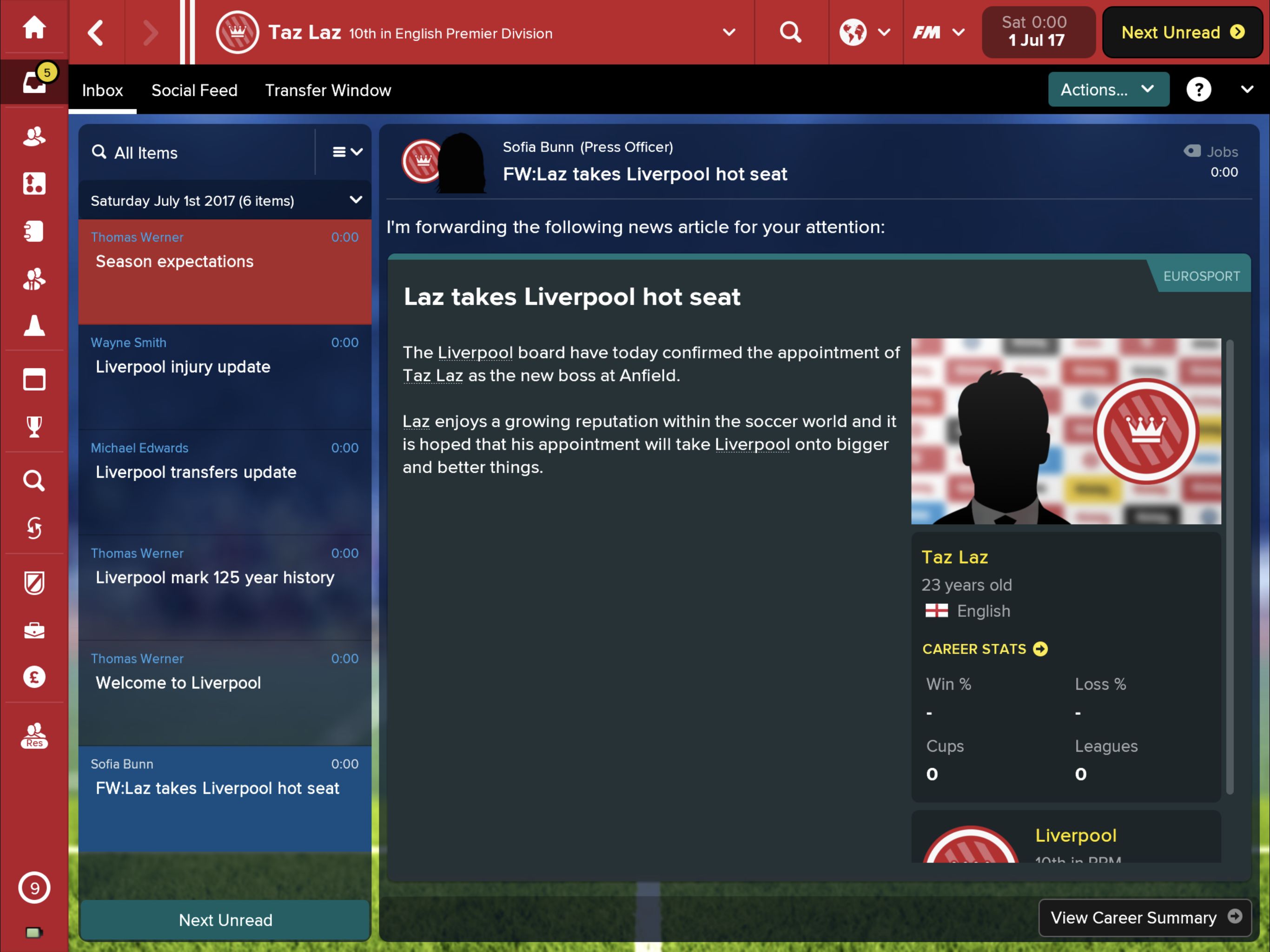
The amount of information in this game can border on overwhelming, and while the UI does a pretty good job managing it and making it accessible, it still occasionally struggles to present all that information to the player. The game has a ton of menus and submenus, and while they are usually no more than a couple of swipes away, they do sometimes make it tricky to find the information you might be looking for. It gets better as you play, but it’s still tricky. Perhaps a search bar for menus (like the Settings search bar on an iPhone) would help solve that issue. The menus, though, are colorful and pretty well-designed, especially given the herculean task that is putting all that information on screen.
What I’ve said earlier should sound familiar to anyone who’s played the previous version in the series, and while in broad strokes the issue of having to navigate all those menus remains, there are some important improvements in FMT 2018 in the Tactics and Match Day screens that make a difference in how you play. In the Tactics screen, SI has managed to present more info in what is essentially two screens turned into one. The two screens overlap and can be dragged back and forth accordingly, a UI design that I think should be used in every other menu because it makes it easier to know where information is located. So yes, this change on the Tactics screen might sound minimal, but it does make a big difference in terms of usability.
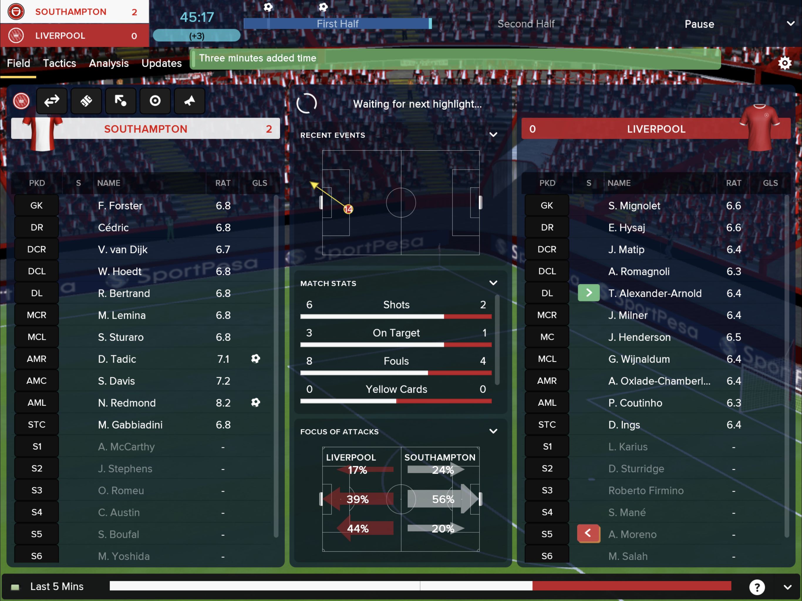
Another big change to the game is the Match Day UI, which again has been overhauled so that it shows more information on one screen. The new Match Day screen allows you to see player ratings, match stats, focus of attacks, and even recent events all on the same screen. In the past, you would have to flick through different windows to see all this info, but now it’s all there in a glance. This reduces the need to navigate various windows when watching a match unfold. Not a groundbreaking change overall but one that really helps you figure out why your team is losing 5-0 to Southampton. And the 3D match engine is more fluid than last year, although it still looks a bit dated. You won’t be playing this game for its 3D visuals, but that was never the case.
Speaking of my 5-0 loss to Southampton, the game still suffers from a tendency to have your team play great against big teams and really badly against weaker ones. I beat AC Milan 1-0 away only to get hammered by the mediocre Southampton the next week. This has been a common issue with Football Manager games since forever, and it’s not because players are complacent (you can see your players’ mood as the game’s unfolding).
And you still get a ton of injuries, which, again, is a trademark of the game but, increasingly, also a trademark of the sport. This year SI added a new Medical Center screen, which is a fun little addition that gives you much more detail on injuries. For instance, it might tell you that a specific player needs to have a lower training load to avoid injuries or other similar info. I’m not sure all this extra info does much to reduce injuries, but it should be helpful for those managers who are detail-oriented micromanagers.
FMT 2018 comes with many other little changes, like additional options when trying to sign a player (for instance, additional promises you can use to entice a hesitant star), and a revamped scouting screen, which does a better job at featuring possible transfers on the main screen and letting you give you more specific criteria to your scouts. I might sound like a broken record again, but all these little changes and addition help improve the game in small ways that, over time, add up to a better overall experience. And the fact that the game hasn’t crashed on me once is definitely a big plus given last year’s issues.
Should you buy FMT 2018 if you already own FMT 2017? That’s always a tricky question with annual releases, but I think FMT 2018‘s improvements (and, of course, updated database) justify the purchase. The UI changes really make navigating the game easier, and the new additions offer extra information to those who want to get even more involved with the lives of their fictional players. The game does come with IAPs, but—as is always the case—they are just ways to make the game easier, if you like to take the easy road, or additional challenges. At $19.99 the game might sound expensive in mobile gaming terms, but FMT 2018 is worth every penny.


