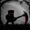
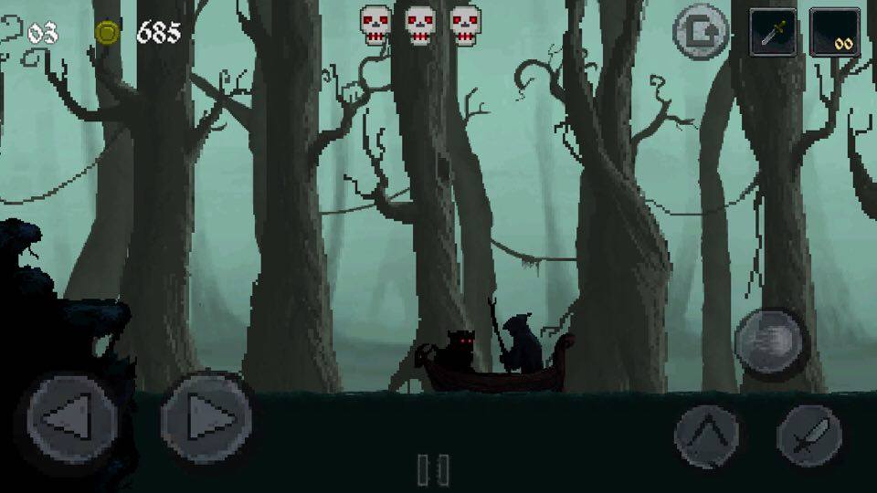
 I almost let this particular game slip completely under my radar, but when I saw some screenshots of it, I knew I absolutely had to play it. I just hoped that the game would live up to the aesthetic. Mahluk: Dark Demon ($0.99) is a hack and slash platformer in the vein of Goblin Sword ($1.99) and Sword of Xolan ($0.99) with a super dark art style in which the foreground is completely silhouetted. It’s not dark in the artsy Limbo ($3.99) kind of way, but more the heavy metal crap-sack demon infested Dark Souls style world way, which I am all about. And while the aesthetic is far and away the best thing this game has going for it, it plays pretty decently as well.
Developed by a couple of Turkish dudes (explaining the handful of spelling and grammar goofs) with one voice actor for the bookend story cut-scenes using the JNA Mobile platformer game kit for Unity, you can hopefully see why this probably won’t be the most polished game on the App Store. Having said that, what is here is actually very impressive for something made by so few people. It’s a pretty standard retro influenced 3 life platformer. The retro influence really comes through in the design, eschewing some modern conventions of convenience to make you earn that victory the hard way. Unfortunately the game is mostly hard because of some clunky controls and collision detection, but it’s not so bad that it ruins the game. I’m going to talk about the cool stuff first, though.

One of the first things I thought of looking at screenshots of the game was Dark Souls. Specifically, the black knight enemies in all the games, with their glowing red and blue eyes. That’s the major visual theme of all characters in the game, and it looks really cool in my opinion. The story is front loaded with a slideshow of some cool pixel art while a narrator explains that a being named Kindar ruled the world so cruelly and completely that even the devil did his bidding, in a dark civilization long before the time of mankind. A mysterious dude was able to escape Kindar’s clutches, and that is who you play as. Some say he is a trained assassin, others an exiled warrior king. All you really need to know is that you have to slash all the things in front of you until they stop existing.
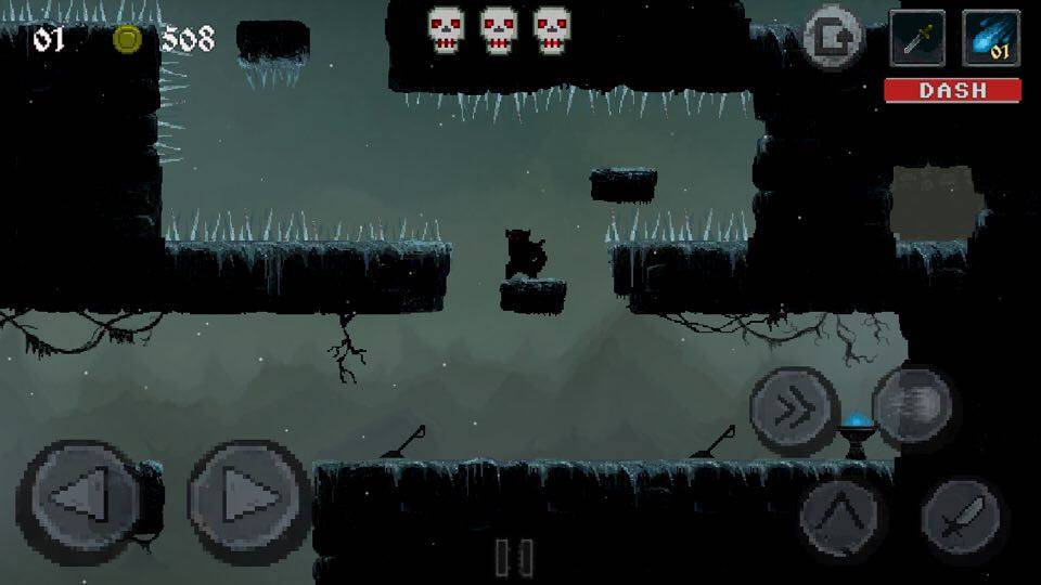
We’re going with some classic iOS virtual button controls. You might be annoyed to find that you can’t just move your finger between the left and right movement arrows, but must lift your finger off of the screen each time. You get used to it, but it’s a bad sign of things to come. You have an attack button, jump button, and spellcasting button for when you pick up spell potions, giving you fire and ice projectile attacks. As you play you’ll accumulate lots of loot. If you don’t notice that the title screen has a ‘shop’ option right away, you’d be forgiven for wondering exactly what this loot is even for after playing several levels with no use for it.

You can back out of the game at any time and use the shop to buy a scythe with longer reach and double the damage of your main sword with a slower swing, a big slab of metal with even slower swing for triple damage, and a dash attack that I found to be more useful for dashing across platforms at the same height. You will probably have bought everything before you reach the final chapter of the game, which is good because you’ll need it, but bad because you’ll probably finish the game with tons of unusable loot. Some other upgrades or some RPG elements would have been cool. Definitely get the scythe first, by the way. It was my go to weapon for the entire game after I found the great sword to be too slow. It’s a great middle ground and kills enemies pretty quickly.
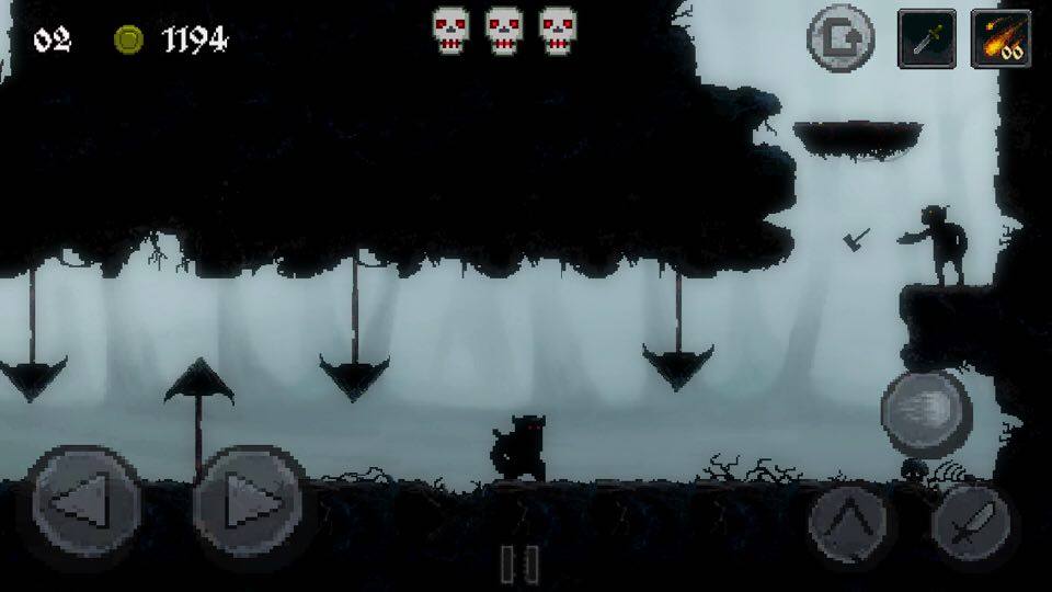
There are 18 levels total, unofficially split into three chapters of 6 culminating in 3 boss fights as you traverse these dark, dead, and twisted forests, swamps, ruins, and eventually Kindar’s castle. It’s here that the aesthetics really switch up. In the first 12 levels the background will shift with different shades of green, blue, and gray and everything has a similar foggy aesthetic, whereas the castle is much more defined and looks more like any other game. The foreground is still silhouetted, even when there are light sources, and it can look a bit weird. It was a nice change of pace, but the first 12 levels have the cooler aesthetic by far. The pixel art itself is fantastic, though the animations can sometimes be as stiff as the controls.

I should clarify that the controls aren’t so bad, but they are compounded by the wonky collision detection, which rarely glitches out completely as your character or loot from a chest you’ve just opened gets stuck in the ground. The problem is that platforming itself doesn’t feel as intuitive as it should, and you will die most frequently to falls. What really sucks is that sometimes a pit will lead to more bits of level, or a secret area, and other times the fall will just kill you, with no way to really tell which is which. Unfortunately, when you have a three life system and very few checkpoints throughout, you’ll quickly become risk averse and not really care about exploring, which is a shame. Sometimes the death zones for a fall seem way too high, as if you maybe could save yourself at the last second.
Collision is also sometimes weird with the combat. If multiple things that you can hit are stacked over each other in the world, like an enemy, chest, and breakable piece of wall, which thing you will hit is a total crapshoot. And for whatever reason, you can hit chests after they’re open, with your sword just bouncing off even if there’s an enemy behind it. I’m harping on about the clunky bits of the game, but it was still enjoyable in the end. Frustrating at times, but enjoyable. The design could very clearly use some more testing and iteration though. There are a lot of rookie mistakes in the placement of things; especially checkpoints. I’m not saying the game needed to be much easier, but not placing checkpoints after super hard areas, or making people go through the easy parts over and over again as they die to the hard parts, just seems Kindar cruel.
(NOTE: The above trailer is for the PC version. There is no trailer for the mobile version. It’s mostly the same but with a few extra mechanics, areas, and enemies)
The main draw here is the style and aesthetic. The music is similarly stylish, sometimes coming off as dark and gothic and other times a bit Arabian. The music made me feel very nostalgic actually, but I have no idea what it sounded like specifically. The game over screen was hilariously bombastic and over the top, which was one thing that made the high frequency of game overs tolerable. I’d recommend playing on an iPhone. Even though it’s a universal game, the visuals don’t scale very well to the iPad. If you want a smoother gameplay experience, or you just have a low tolerance for some clunk, you should probably look elsewhere. If you are curious, there is a free version (Free) to try as well. At only a dollar, it took me about 2 and a half hours to beat the game, and I’d say I got my money’s worth.