 Shenandoah Studios’ The Battle of the Bulge ($9.99) is to the iPad what SSG’s fabled Panzer General was to PC gaming in the ’90s. Its a game that will make historical strategy diehards swoon, while also being pretty enough, and easy enough to learn, to draw in people who never knew that this was the game they’d been waiting for.
It’s even educational, with day-by-day summaries of the historical course of the Axis’ last offense and additional materials about the battle presented in an incredibly appealing “magazine" format with historical photos. This is a game that could be taught in a military history class.
There are several things that Battle of the Bulge is not, by design. It’s not real time, it’s not a multi-mission campaign, it’s not a game where you can see every soldier fight and die in 3D animated gore, thank the strategy gods.
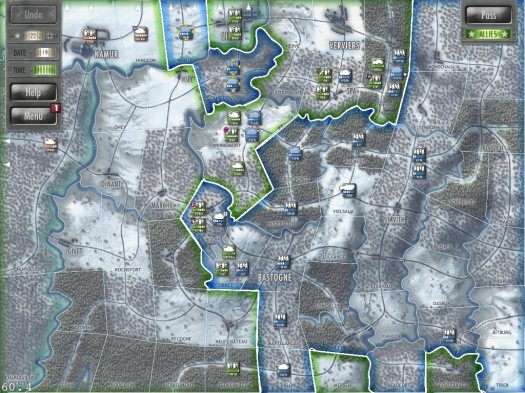
Battle of the Bulge is a wargame on what grognards call the “operational" scale: neither “grand/strategic" (representing complete control of an entire nation or at least its military on a given front) nor “tactical" (squad/unit level). You maneuver entire formations across a territory-level (not hex) map.
The result is a game that looks a little like, and is nearly as easy to control as Risk, while being much deeper in strategy. Terrain effects, including roads, bridges, and defensive cover, are an essential part of strategy, as are lines of supply.
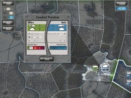
Units are fairly simple, but sufficient: regular and elite infantry, mechanized infantry, and armor, with artillery and airpower as environmental effects. Every unit is historical, based on the actual unit, its strength (represented in “pips") and experience (represented for elite units with a badge containing their historical insignia). Combat is resolved quickly and elegantly, with just enough of an audiovisual flourish to be appealing (much like Panzer General), and those flourishes can be skipped or turned off in the menu.
 The full set of movement and combat modifiers is easily accessible under the Charts and Tables tab of the Help menu, which has been designed to look like the dogeared contents of a field desk.
Well-considered touches in terms of design abound, from tabletop-inspired unit “chits" that are easy to drag about, to the bluish look of the map and menu (the Battle of the Bulge was a winter offensive), to the way that the game review presents the full map. There’s also snippets of period footage of military units, colored “glows" when control of a territory changes, a scrolling sidebar with place names and combat results, and a dynamic chart showing victory points as they shift back and forth.
The game looks and feels like it was designed specifically for the iPad, which it was. Shenandoah Kickstarted this game and its sequel, El Alamein, specifically for this platform. Don’t expect a Universal update: the game plays very well on my iPad mini, but even there I can see how a retina iPad would allow one to play without ever needing to zoom in. The strategic overview that is so essential to the game would be frustrating, at best, on an iPhone.
The game supports live multiplayer “board game" style on a single iPad, or on two separate iPads, as well as multiplayer with friends and random opponents over Game Center. Multiplayer is where the game’s replayability lies: with only two scenarios (the signature battle and the abbreviated “Race to the Meuse"), you’ll explore the single-player possibilities soon enough (you can play both sides, and against each of two AIs modeled on historical generals, but that’s still only eight combinations).
It remains to be seen whether additional scenarios are forthcoming: if so, they would almost have to be speculative, rather than strictly historical.
Battle of the Bulge is a must-have for anyone with an interest in historical wargaming. It’s only flaws are limited single-player replayability and the fact that it is so easy to start playing that some players may jump in expecting a Risk-like game, only to become frustrated when the game’s nuances assert themselves.

